Last changed
30 Sept 2011 ............... Length about 1400 words (10,000 bytes).
(Document started on 5 Dec 2008.)
This is a WWW document maintained by
Steve Draper, installed at http://www.psy.gla.ac.uk/~steve/patera/colour.html.
You may copy it.
How to refer to it.
Web site logical path:
[www.psy.gla.ac.uk]
[~steve]
[patera]
[this page]
What I know about colour
By
Steve Draper,
Department of Psychology,
University of Glasgow.
This is a summary of key points about colour, some of which I learned from
Marianne Patera.
- To a physicist, light is characterised by intensity (magnitude of the
wave), frequency / wavelength, phase, polarisation. Human eyes cannot detect
polarisation (unlike bees), nor phase (unlike a hologram). Colour is our
percept of information related to wavelength.
- The vast majority of humans see colour in a way that can be described
as a 3 dimensional space i.e. with 3 degrees of freedom: trichromatic. Some
animals see it as 1 dimensional (monochromatic, i.e. they don't see colour at
all, only light vs. darker); some (including many primates) as 2 dimensional;
and there may be some that see it with more than 3 dimensions. There is
nothing unique or clearly best about trichromacy. Some animals (e.g. bees)
are also trichromatic, but the dimensions are somewhat different than the ones
humans see (they see into the ultra violet).
In printing however, at least 4 inks (one of them black) are needed to
reproduce all colours.
- Because wavelengths are infinitely variable but our perceptual system
collapses this to only 3 dimensions, there are (infinitely) many different
mixes of lights that look identical to us (e.g. red) but which are quite
different from each other to a physicist's instruments (a spectrometer).
These cases are not particularly common in everyday life, but certainly occur.
(Thus "red light" is a vague phrase, except where it means "light
that looks red to humans", because many different light mixtures look red. If
a physicist uses "red light" they probably mean monochromatic light: light
that is not a mixture but has only one narrow wavelength. This is clear, but
note that there is no monochromatic light for the hue purple.)
- It is quite untrue that a given light (or light mixture) entering our
eyes always looks the same colour to humans, i.e. directly determines our
colour perception. As Edwin Land demonstrated, the colour we perceive depends
on the relationship of the light's wavelength (or mixture of wavelengths) to
that of other colours in view. It is the contrast (difference) in colour
across boundaries that is the basis of our colour perceptions, not the
wavelengths directly.
(This of course is what we, or any adapted animal, would want: we
don't want the colours of objects to change when the light changes e.g. from
the red of a setting sun, to the near-white of noon, to the yellow of most
indoor lighting.)
Land, Edwin (1977) "The Retinex Theory of Color Vision"
Scientific American December (no.12) pp.108-128
- Our colour perception is based on our eyes having 3 different colour
receptor types. These are often called red, green, and blue receptors, but
this is grossly inaccurate. Firstly, all 3 types are sensitive to some extent
to all wavelengths (i.e. they all respond to red, all respond to green, all
respond to blue): they differ in their peak sensitivity. But, secondly,
it is also inaccurate to say their peak sensitivity is to red, green, and blue
light. (The "red" receptor's peak response is to yellow light.)
All that matters is that they have different sensitivities, and colour
perception is based on the differences between the signals they produce.
- Perceptually, we tend to see colours
as organised around a few, distinct colours i.e. our colour percepts are
bumpy or hierarchical, not smooth and continuous. This is manifest when you
look at a rainbow. A physicist can convincingly demonstrate to you that the
spread of colours is a continuous smooth spectrum to his instruments, but we
all see the rainbow as composed of a handful of separate bands of colours.
This is in contrast to shades of gray which we see as forming a smooth
continuum; and it is not to do with the fact that we see by means of a mosaic
of discrete detectors (rods and cones): our perception yields to us an
impression of smooth continuous space. Furthermore most people are aware
of some relationships between hues, but not others: that pink and red are
related, and orange is related to red and yellow; yet to me, at least, brown
seems on its own (although theory categorises it as yellow desaturated by
adding black). Thus it is a striking fact that, and an unanswered question
why, our perceptual system presents an impression of visual continuity for
space and for lightness, but not for colour hue.
- Nevertheless, though it is not intuitively obvious to us, given a
large number of different shades of colour, they can be arranged into a 3D
(but not a 2D) space in the sense that you can find arrangements in 3D in
which every colour imperceptibly shades into its nearest neighbours in every
direction, and no colours are left without a place.
However there are numerous such 3D organisations, just as in geometry there
are rectangluar Cartesian coordinates, and alternatively polar coordinates.
One organisation is RGB (red, green, blue), which corresponds to composing
colours by mixing 3 coloured lights in different proportions. Black is given
by zero amounts on all 3 dimensions, white by maximum intensity on all 3.
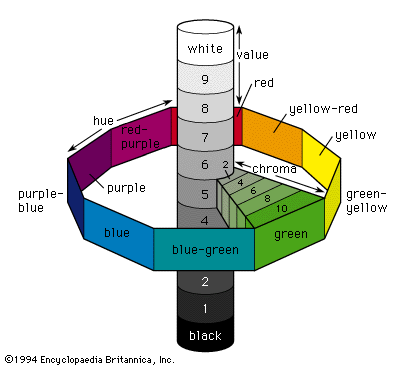
This is often used for driving computer colour monitors. A quite different
organisation is hue, saturation, and lightness. Lightness goes from black to
white; saturation corresponds to the pastel quality of colours e.g. pink is
half saturated red, primrose is half saturated yellow, and represents how much
gray is mixed into the "pure" hue; hue is the dimension we think of as
colour as opposed to gray. To a physicist, the colours of the spectrum form a
line from blue to red; but in human perception, hue is a circle where the blue
to red sequence runs on through purple back to blue. Thus while RGB are
rectangular coordinates, hue, saturation, lightness are cylindrical or
spherical coordinates.
See these links for examples:
 1
2
3
4
- There is a high degree of consensus between people and cultures on the
centre of basic colours: e.g. if you spread out a range of shades of red, there
will be high agreement about which is the most quintessential shade of red.
- There is a little consensus between people even within one culture on
the boundaries between basic colours.
E.g. if you spread out a sequence of shades where one end is clearly blue and
the other end green and many intermediate shades, there is little agreement
(though there are often strong opinons) about where to draw the boundary
between blue and green.
- Where large surfaces such as the walls of a room meet at a corner, the
colour of one may modify the perceived colour of the other: perhaps because of
light reflected from one on to the other.
- The shape of an object also affects its perceived colour.
- Although we can detect the colour of extremely fine printed lines, or
of enormous surfaces, the "same" colour has a quite different effect on us in
these cases. This is familiar to many people from the problem of choosing a
paint for a room's walls from a colour sample book with postage stamp sized
samples. Most people essentially cannot envisage how a wall's colour will
appear to them on such a basis. What matters is the visual angle the coloured
surface fills (from our viewpoint), rather than the physical size.
- There are pronounced associations between colour and emotion, but
(contrary to what some have claimed) there is little consensus
(though there are often strong opinions) about the associations. The
associations you yourself have are probably not shared by the person sitting
next to you. This is obviously an important fact to grasp if you are a
designer, and is the basis for exercises in Itten's famous textbook.
Johannes Itten (1961) The art of color: The subjective experience and
objective rationale of color (Reinhold publishing corp.: NYC). Tr. E. van
Haagen.
- Colour has been shown to have a marked effect on creativity in an
experiment where blue items prompted much more creative uses than red items.
In fact, their work shows that red induces an "avoidance motivation" mindset
(cautious, avoid-mistakes)
that leads to higher scores on tasks like memorising, proof-reading,
arithmetic; while blue induces an "approach motivation" mindset (peace,
tranquility, be innovative) that is better for creativity tasks.
Mehta,R. & Zhu,R.J. (2009) "Blue or Red? Exploring the Effect of Color on
Cognitive Task Performances" Science vol.323 no.5918 pp.1226-1229
DOI: 10.1126/science.1169144
Web site logical path:
[www.psy.gla.ac.uk]
[~steve]
[patera]
[this page]
[Top of this page]
