07 May 1996 ............... Length about 2100 words (13000 bytes).
This is a WWW version of a document. You may copy it.
How to refer to it.
To fetch a postscript version of this to print
click this.
Visualisation by tables
Stephen W. Draper
GIST (Glasgow Interactive Systems cenTre)
Department of Psychology
University of Glasgow
Glasgow G12 8QQ U.K.
email: steve@psy.gla.ac.uk
WWW URL: http://www.psy.gla.ac.uk/~steve
This is a position paper for the 1996 Fadiva workshop at Gubbio.
Contents (click to jump)
Introduction
Tables
The space of tables
Usability features
Visual layout of tables to support problem solving
References
One of the oldest visual representations of data is tables: 2
dimensional rectangular grid layouts. This paper argues that:
-
We do not understand these well.
-
That most software cannot generate general table layouts for data of the kind
that are in fact common in printed booklets in common use.
-
That this gap occurs because a lot of data is multi-dimensional, and that
there are an interesting set of choices to make in mapping multi-dimensional
data on to the 2 picture dimensions of ordinary tables.
-
That the best layout depends not just on the data but on the task the user is
going to be performing.
-
That many of our instincts (our first choices) about layout are in fact not
good ones and do not help performance of the specified task.
-
That as well as the need for better understanding and new table generation
tools, it is likely that simple interaction aids would also greatly improve
computer-presentation of tables to users.
A simple printed table has a close connection to a database relation:
the analogy is widely used in introductory database courses. However
inspection of the variety of tables found in books shows that there is more to
be said. The canonical kind of table generated from a relation (e.g. fig.1)
uses rows for tuples (entities in the simple cases we shall concentrate on),
and columns for relationship parts (attributes in the simple case). However
where tables have been designed by people for visual convenience, other
patterns are common. In fig.2 not one but two columns are used for one
attribute (which has two alternative enumerated values) with the result that
two tuples are encoded in each row. This example can be generated by few if
any of the output facilities attached to databases, yet it saves space (by
adding one column, it halves the number of rows), and furthermore it is
perfectly comprehensible, perhaps more so than the standard alternative
(fig.3).
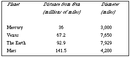
Fig.1
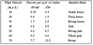
Fig.2
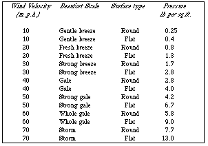
Fig.3
A graph or scattergram is 2 dimensional in the sense that the X and Y
axes represent real values, while the presence or absence of a point specifies
a relation between them at that pair of values. A table might be thought of as
basically 3 dimensional, in that while the X and Y dimensions can be used to
represent two independent values, the number appearing in a cell of the table
can specify a third e.g. you could have a table of latitude and longitude
values, with height above sea level appearing in the cells. However tables are
used in many other wayss, much of the flexibility coming from the fact that the
data values for a "dimension" i.e. attribute of the data domain either form an
enumerated type formally (e.g. the days of the week) or else in practice occur
only in a few values e.g. pipes supplied in only a few different diameters.
A set of types of table might be as follows:
-
No dimensions e.g. the Macintosh desktop display, or the array of iconic
commands in the Hypercard Tools menu or the Clarisworks drawing tools palette,
where position has no particular meaning. [0 dimensions.]
-
A histogram, where one dimension represents data values, and the other (the
height of the bars) represents the count of instances of that value. [1
dimension enumerates an attribute, 1 represents counts on instances /
entities.]
-
Railway timetables. Here one dimension enumerates stations at which the
trains may stop, while the other (often unlabelled) dimension enumerates the
trains (the entities that occur). [2 dimensions represent entities, cells
represent an attribute relating them.] Similarly you might have a table of
distances between cities, where the latter are enumerated on both dimensions
and the distances are in the cells; or a table giving salary (in the cells) as
a function of job title and number of years in that job.
-
Timber by length, breadth, depth permuted in 3 columns, and price in a
fourth column (fig.4). [One dimension for entities (available types of timber
piece), the other for multiple attributes.] Obviously such columns can be
multiplied indefinitely in two ways: a) for each entity, more attributes than
price can be represented each in an additional column. b) An entity can be
defined using a combination of more than three defining attributes, provided
they are enumerable.
-
Timber by length and breadth permuted in 2 columns; dept enumerated over
columns each of which has a price in the cell. Thus there are several prices
(and several entities) per row e.g. fig.5. [One dimension for sets of
entities; the other dimension lists two attributes and enumerates the values
of a third; each cell value both shows the value of one attribute and
represents a distinct entity-instance.]
-
Another technique that can be combined with the above is to have an extra
column (or row) in which any number of marks (including no marks) can be added.
Railway timetables use such marks, like footnotes, extensively. They are used
whenever the entities normally have a standard value of some attribute which is
therefore not worth representing by a column, but when an entity has a
non-standard value then a special mark is put in the extra column or row.
Several such attributes can share a column of special marks like this.
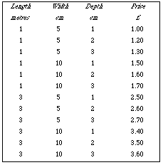
Fig.4
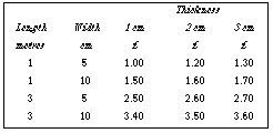
Fig.5
Although the space for table design indicated above suggests the range
of alternatives, it did not mention a further important factor: how the design
of a table should depend upon the task the user will try to perform. In fact
both which items are chosen for a picture dimension and the ordering (sorting)
of items have a large effect on how usable a table is for a particular task.
For example if you know the approximate length, width, and thickness of the
timber you want, then both figs. 4 and 5 are quite easy to use and to discover
how much it will cost. On the other hand if you have a fixed amount of money
and want to discover how big a piece of timber you can buy then fig.4 is quite
usable, but fig.5 will be difficult. Similarly if want to compare how rounded
surfaces behave in different wind speeds, then fig.3 will be much less usable
than fig.2. On the other hand if you know a critical pressure a material (e.g.
window glass) can withstand, and want to read off the speeds and surface shapes
then fig.3 will be much better than fig.2. Thus table layout depends on the
user task as well as on the data.
Computer presentation of tables would allow interactive features as well as
layout design to address usability. The examples above are small for
convenience in writing this paper, but very many real examples involve larger
tables (e.g. railway timetables). When you see people using printed tables
they frequently use extra aids such as rulers or ruled lines to help the eye
follow along a row or column. Some of the operations that might be useful
would highlight parts of the table. For example:
* Touch a column header to highlight the whole column.
* Conversely, touch a cell and have its row and column highlight, partly to
help read off the relevant headings. In fig.5, the title "Thickness" applies
to three columns, so doing this highlighting correctly is not quite trivial.
* Another useful operation would be to touch a cell and have all the cells with
the same value highlight: for instance in fig.4 touching "3" in the "depth"
column should highlight all the rows with the value 3 for depth, thus
overcoming the disadvantage of that table design for users who know the depth
but are still considering which length or width to choose.
* Where, but only where, a cell corresponds to a unique entity (e.g. the price
cells in fig.5 and elsewhere), then double clicking could display a special
window showing just that entity and its attributes, which in fig.5 does not
correspond to any row, including perhaps attributes not displayed in the
original table.
In this way, interactive features could make tables presented by computers more
usable than their paper counterparts (instead of less, because of poorer screen
resolution), and furthermore could compensate for table layouts that turned out
not to be optimal for a particular user task.
This section describes a particular task that has been studied in
experiments reported in the literature, and the impact of different table
layouts on the task. As I shall argue in my talk, none of the layouts studied
in the past are in fact optimum for the task, and the whole problem suggests
both that we are not very good at picking optimum designs for tables, and
secondly that tools for dynamically changing table layout might prove very
useful.
Berry & Broadbent (1989, 1990) studied a problem solving task based on
using printed tables of data. The task is to play the role of a river
inspector who has to decide which company is responsible for a pollution
incident. A table lists the unique combination of chemical pollutants each
company uses, and the task is to request in sequence a series of tests until
the company responsible can be determined. As tests cost money, the best
solution will minimise the number of tests needed.
Berry & Broadbent were mainly concerned with what strategies people used,
and how they could be trained in the optimum (binary split) strategy. In fact
people are in many cases very resistant to using the optimum strategy, even
when given direct training. This inability to use the best strategy seems to
be due to the layout of the table given to subjects, which in their experiments
consisted of a list of factories, and against each factory name, a list of
pollutants.
Gilmore (1991) ran variations on these experiments. His purpose was to analyse
an apparent cognitive dimension of "visibility" into three dimensions, which he
named accessibility, salience, and congruence. He compared four table layouts
by varying a) whether the tables gave factories first then pollutants against
factories, or vice versa; b) whether the secondary properties (e.g.
pollutants) were given as a list or in a grid so that a reader could easily
scan for all the primary instances (e.g. factories) that shared a given
property (e.g. pollutant). Gilmore showed that:
a) Different table formats vary the difficulty of carrying out any given
method; and conversely the usefulness of a format depends on the method
used.
b) Different table formats vary the difficulty of the task (i.e. of the best
method for the task, given the format).
c) The method chosen by the user depends on the task but also on the user.
d) The method chosen by the user, and whether they choose the optimum
procedure, is affected by another property of the format ("salience"), largely
independent of features determining difficulty. I.e. what procedure seems
obvious to users is also, but independently, influenced by table format, and
this is often independent of any explicit training given to subjects.
These tables are in effect a visual notation for supporting a task. The format
of these tables, then, can be varied in a number of ways including: by which
of the two entities (factories or pollutants) is primary, by whether lists or a
2D grid layout is used (i.e. whether columns are meaningful), by whether each
of the dimensions has random order, alphabetic ordering, or some other
ordering. Berry & Broadbent fixed on one format and studied how users
could choose a method for the task given the format. Gilmore compared formats,
showing effects on choice of method and on the effectiveness of a chosen
method, and hence on task performance. However it is interesting to consider
an alternative task: not how to choose each test for pollutants in turn, nor
how to choose a method for that task, but how to make reformatting choices for
the table in order to make the task easier: the corresponding visual notation
selection task.
In the talk, I will illustrate some of these alternative formats, and also (by
asking the audience to suggest modifications to the current format) that we are
actually poor at choosing a better or optimum format for the task.
Berry,D.C. & Broadbent,D.E. (1989) "Problem solving and the
search for crucial evidence" Psychological research vol.50
pp.229-236
Berry,D.C. & Broadbent,D.E. (1990) "The role of instruction and
verbalization in improving performance on complex search tasks" Behaviour
and information technology vol.9 pp.175-190
Bertin, J. (1977 / 1981) Graphics and graphic information processing
(Walter de Gruyter: New York).
Gilmore, D.J. "Visibility: a dimensional analysis" in HCI'91 People and
Computers VI: Usability Now! (eds.) D.Diaper & N.Hammond pp.317-329
(Cambridge University Press: Cambridge).